Week 1: September 9, 2024
This blog is an ongoing project for Professor Ryan Enos' Election Analytics Course at Harvard College (GOV 1347, Fall 2024). It will be updated weekly with posts analyzing how different features impact the likelihood of Kamala Harris (D) or Donald Trump (R) winning the 2024 U.S. Presidential Election or winning specific states in the election. The blog will culminate in a final predictive model for the outcome of the general election. Some posts, such as this one, will examine the state of existing polls and try to explain variation between them.Question
While keeping up with predictions for the upcoming presidential election and making my own, I find myself float towards newspapers and media outlets. I consider myself an avid consumer of journalism, and find newspapers reliable for updated polling information. But I know that this is not true of all individuals in the electorate. In this post, I wonder if events that make headlines matter as much to voters as they do to polling agencies. That is, are pollsters are justified when they survey the electorate after a major event, or do the events reported on impact the views of their populations less than it impacted their thoguht processes. I'd imagine that polls sponsored by news organizations tend to undergo updates after *those same* news organizations publish major stories, so I'd like to see if sponsored polls yield similar results to each other.The Data
The New York Times' 2024 Election Poll Tracker is updated daily with predictions for candidate performance based on aggregate results from of nation-wide and state-specific surveys. The surveys it uses are collected and displayed in a table on the poll tracker's website. I scraped these surveys from the Times' website into a JSON file with fields such as the pollster's name, whether the poll had any sponsorship, and the poll's results. Then I wrote a simple Python script to convert the JSON file into a CSV format (election-blog/jsontocsv.py) Then I looked for differences in the estimates of polls sponsored by external agencies/organizations versus those not sponsored at all. In a future analysis, I hope to compare polls sponsored by news outlets to polls sponsored by other organizations (e.g. colleges, universities), but due to the limited sample size (The New York Times only provided 50 polls because it did not include any polls that began earlier than August 6, 2024. Only 17 of them were sponsored at all) I chose to compare polls sponsored by *any* entity to those run by independent pollsters in this post.Methods/Analyses
# install packages
library(ggplot2)
library(maps)
library(tidyverse)
## ── Attaching core tidyverse packages ──────────────────────── tidyverse 2.0.0 ──
## ✔ dplyr     1.1.3     ✔ readr     2.1.5
## ✔ forcats   1.0.0     ✔ stringr   1.5.0
## ✔ lubridate 1.9.3     ✔ tibble    3.2.1
## ✔ purrr     1.0.2     ✔ tidyr     1.3.0
## ── Conflicts ────────────────────────────────────────── tidyverse_conflicts() ──
## ✖ dplyr::filter() masks stats::filter()
## ✖ dplyr::lag()    masks stats::lag()
## ✖ purrr::map()    masks maps::map()
## ℹ Use the conflicted package (<http://conflicted.r-lib.org/>) to force all conflicts to become errors
library(jsonlite)
##
## Attaching package: 'jsonlite'
##
## The following object is masked from 'package:purrr':
##
##     flatten
# import data
all_nyt_polls <- read_csv("polls-nyt.csv")
## New names:
## Rows: 50 Columns: 25
## ── Column specification
## ──────────────────────────────────────────────────────── Delimiter: "," chr
## (13): pollster, sponsors, pollster_partisan, geo, results, population, ... dbl
## (5): ...1, margin, sample_size, fte_question_id, poll_weight_no_time_d... lgl
## (4): sponsoring_candidate_name, sponsoring_candidate_party, is_select,... dttm
## (1): ready_at date (2): start_date, end_date
## ℹ Use `spec()` to retrieve the full column specification for this data. ℹ
## Specify the column types or set `show_col_types = FALSE` to quiet this message.
## • `` -> `...1`
colnames(all_nyt_polls)[1] <- "index"
head(all_nyt_polls)
## # A tibble: 6 × 25
## index pollster sponsors pollster_partisan sponsoring_candidate…¹
## <dbl> <chr> <chr> <chr> <lgl>
## 1 0 Outward Intelligence [] <NA> NA
## 2 1 RMG Research [{'sponso… <NA> NA
## 3 2 Emerson College [{'sponso… <NA> NA
## 4 3 Emerson College [{'sponso… <NA> NA
## 5 4 Emerson College [{'sponso… <NA> NA
## 6 5 Emerson College [{'sponso… <NA> NA
## # ℹ abbreviated name: ¹sponsoring_candidate_name
## # ℹ 20 more variables: sponsoring_candidate_party <lgl>, geo <chr>,
## # margin <dbl>, start_date <date>, end_date <date>, results <chr>,
## # population <chr>, sample_size <dbl>, race_type <chr>, ready_at <dttm>,
## # is_select <lgl>, url <chr>, office_type <chr>, nyt_race_id <chr>,
## # nyt_matchup_id <chr>, fte_question_id <dbl>, matchup_type <chr>,
## # matchup_id <chr>, is_partisan <lgl>, poll_weight_no_time_decay <dbl>
As an exploratory exercise, I will investigate the difference in the average sample sizes of sponsored and unsponsored polls.
# separate sponsored polls from independent polls
sponsored_polls <- subset(all_nyt_polls, sponsors != '[]')
independent_polls <- subset(all_nyt_polls, sponsors == '[]')

# explore the sample sizes of sponsored versus non-sponsored polls
table(sponsored_polls$sample_size)
##
##  400  600  617  626  682  708  789  815  845  945  976 1200 1386 1389 1778 2701
##    1    1    1    1    1    1    1    2    1    1    1    1    1    1    1    1
table(independent_polls$sample_size)
##
##   323   400   788   800   804   814   820   822   826   857  1000  1003  1082
##     1     5     1     4     2     1     1     1     1     1     3     1     1
##  1083  1089  1890  3047  4000 11414
##     1     1     1     1     5     1
# is the average sample size significantly different between sponsored and
# unsponsored polls?
# t.test for difference in means
t.test(sponsored_polls$sample_size, independent_polls$sample_size)
##
## 	Welch Two Sample t-test
##
## data:  sponsored_polls$sample_size and independent_polls$sample_size
## t = -1.6978, df = 39.649, p-value = 0.09738
## alternative hypothesis: true difference in means is not equal to 0
## 95 percent confidence interval:
##  -1469.6417   127.9447
## sample estimates:
## mean of x mean of y
##  1016.000  1686.848
Based on Welch’s Two-Sample T-test, the difference in mean sample size between sponsored and unsponsored polls is not significant (p-value of 0.09). The mean sample size in sponsored polls is actually smaller than that in unsponsored polls, which surprised me because I would have thought that sponsored polls would have greater resources to collect larger surveys. For sponsored polls, the mean sample size was 1016 and for unsponsored polls, it was 1686. However, in this dataset, state-wide polls and nation-wide polls are treated the same, which could help explain some of the variance. Below are two tables, showing the domains of sponsored and unsponsored polls (e.g. whether they were specific to a state, and which state, or whether they were nation-wide).
print(table(sponsored_polls$geo))
##
## AK AZ CA FL GA MI NV OH PA TX US WI
##  1  1  1  1  1  1  1  2  1  2  4  1
print(table(independent_polls$geo))
##
## AZ FL GA IL MD MI NC NV OK PA TN TX US WI
##  2  1  2  1  1  2  3  2  1  2  1  2 11  2
The spreads of states represented by sponsored and unspored polls are similar. There are 4 nation-wide sponsored polls in the dataset and 11 unsponsored nation-wide polls, which, as expected, may explain the (albeit insignificant) difference in average same size between the two types of polls.
Next I look into the results of sponsored and unsponsored polls.
# clean the results of the sponsored and unsponsored polls for analysis
sponsored_polls$leading_candidate <- substr(sponsored_polls$results, 14, 19)
independent_polls$leading_candidate <- substr(independent_polls$results, 14, 19)

# print tables with the results of sponsored and unsponsored polls
sponsored_table <- table(sponsored_polls$leading_candidate)
print(sponsored_table)
##
## Harris Trump'
##      9      8
independent_table <- table(independent_polls$leading_candidate)
print(independent_table)
##
## Harris Trump'
##     17     16
Among the sponsored polls, 9 predicted Kamala Harris as winning the presidency and 8 predicted Donald Trump. There was a similar 1-poll difference in the unsponsored polls: 17 predicted Kamala Harris as winning and 16 predicted Donald Trump. This underscores the fact that, by all accounts, the election will be close. In a future blog post, I will dive into the sponsors’ party affiliations and how that impacts the spread of sponsored versus unsponsored polls that show Kamala Harris leading versus Donald Trump.
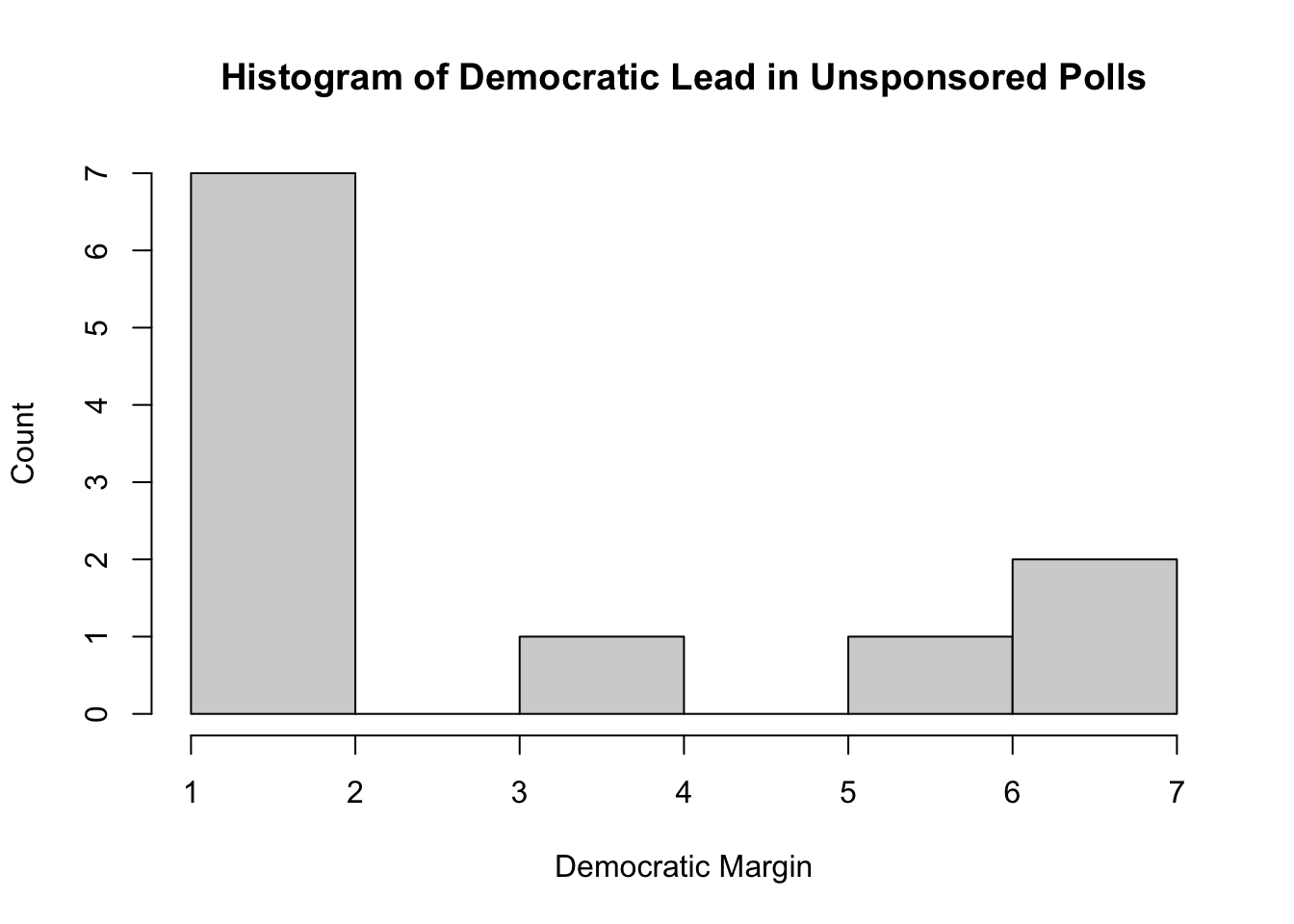
Finally, I analyze the margins by which sponsored and unsponsored polls predicted each of the candidates winning.
sponsored_margins <- table(sponsored_polls$margin)
unsponsored_margins <- table(independent_polls$margin)
hist(sponsored_margins, main="Histogram of Democrat Lead in Sponsored Polls", xlab="Democratic Margin", ylab="Count")
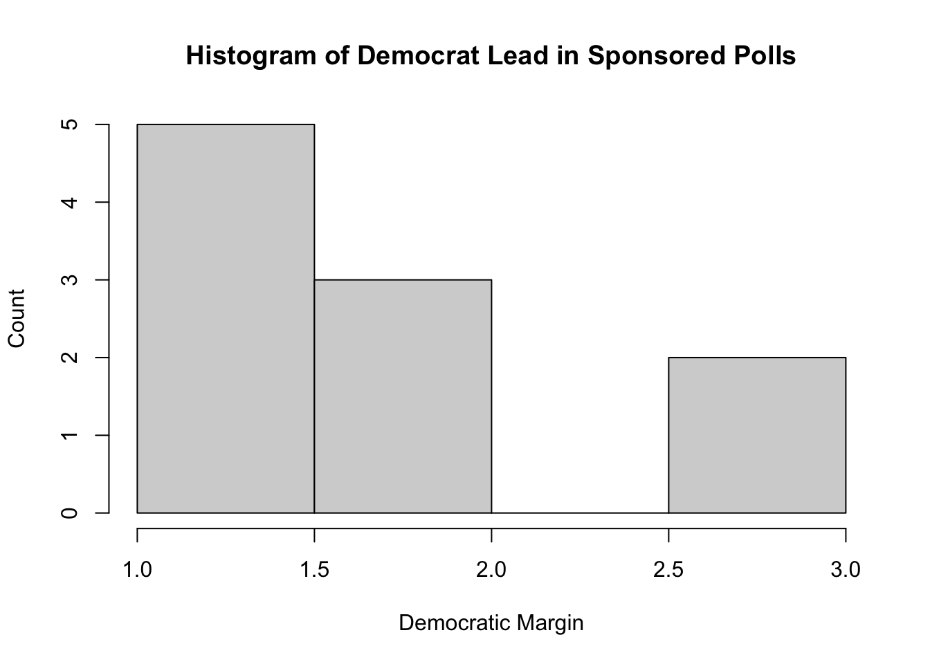
hist(unsponsored_margins, main="Histogram of Democratic Lead in Unsponsored Polls", xlab="Democratic Margin", ylab="Count")
Limitations
Since I only compared sponsored polls to non-sponsored polls here, I did not account for the political party of the sponsor organizaton, which would likely explain much of the variance in the polls' results. However, there were only three sponsoring organizations that disclosed any party affiliation in the dataset, so verifying a statistically significant relationship between that affiliation and the similarity of forecasts would be challenging.Extension Section
For a taste of something more predictive about the election itself, rather than explanatory about existing polls, I present *several maps of the U.S. showing which states were considered battleground states over time.* This extension is relevant to the question about polls posed in this post because some of the polls analyzed only address certain states. The data used in this section comes from the GOV 1347 Lab Session on September 4th, 2024. It contains the state-by-state 2-party vote share for every U.S. Presidential Election since 1948.# Adapted from lab
states_map <- map_data("state")
d_pvstate_wide <- read_csv("clean_wide_state_2pv_1948_2020.csv")
## Rows: 959 Columns: 14
## ── Column specification ────────────────────────────────────────────────────────
## Delimiter: ","
## chr  (1): state
## dbl (13): year, D_pv, R_pv, D_pv2p, R_pv2p, D_pv_lag1, R_pv_lag1, D_pv2p_lag...
##
## ℹ Use `spec()` to retrieve the full column specification for this data.
## ℹ Specify the column types or set `show_col_types = FALSE` to quiet this message.
d_pvstate_wide$region <- tolower(d_pvstate_wide$state)
# Some code in this chunk adapted from lab
pv_map <- d_pvstate_wide %>%
  filter(year == 2020) %>%
  left_join(states_map, by = "region")

# New Code
# Create Column for vote share from 4 years prior
d_pvstate_wide <- d_pvstate_wide %>%
                  arrange(state) %>%
                  mutate(D_pv_prev = lag(D_pv, 1),
                         R_pv_prev = lag(R_pv, 1)) %>%
                  # Filter for elections from 1952 until present
                  filter(!is.na(D_pv_prev))

# Adapted from lab, new coloring metric
d_pvstate_wide %>%
  filter(year >= 1952) %>%
  full_join(states_map, by="region") %>%
  mutate(winner = ifelse(R_pv > D_pv, "republican", "democrat"),
         swing_margin = (D_pv/(D_pv+R_pv))-(D_pv_prev/(D_pv_prev+R_pv_prev))) %>%
  ggplot(aes(long, lat, group=group)) +
    facet_wrap(facets = year ~.) +
    geom_polygon(aes(fill=swing_margin), color="white") +
    scale_fill_gradient(name=waiver(), high="#0000FF", low="#FF0000", aesthetics="fill") +
    theme_void()
## Warning in full_join(., states_map, by = "region"): Detected an unexpected many-to-many relationship between `x` and `y`.
## ℹ Row 1 of `x` matches multiple rows in `y`.
## ℹ Row 1 of `y` matches multiple rows in `x`.
## ℹ If a many-to-many relationship is expected, set `relationship =
##   "many-to-many"` to silence this warning.
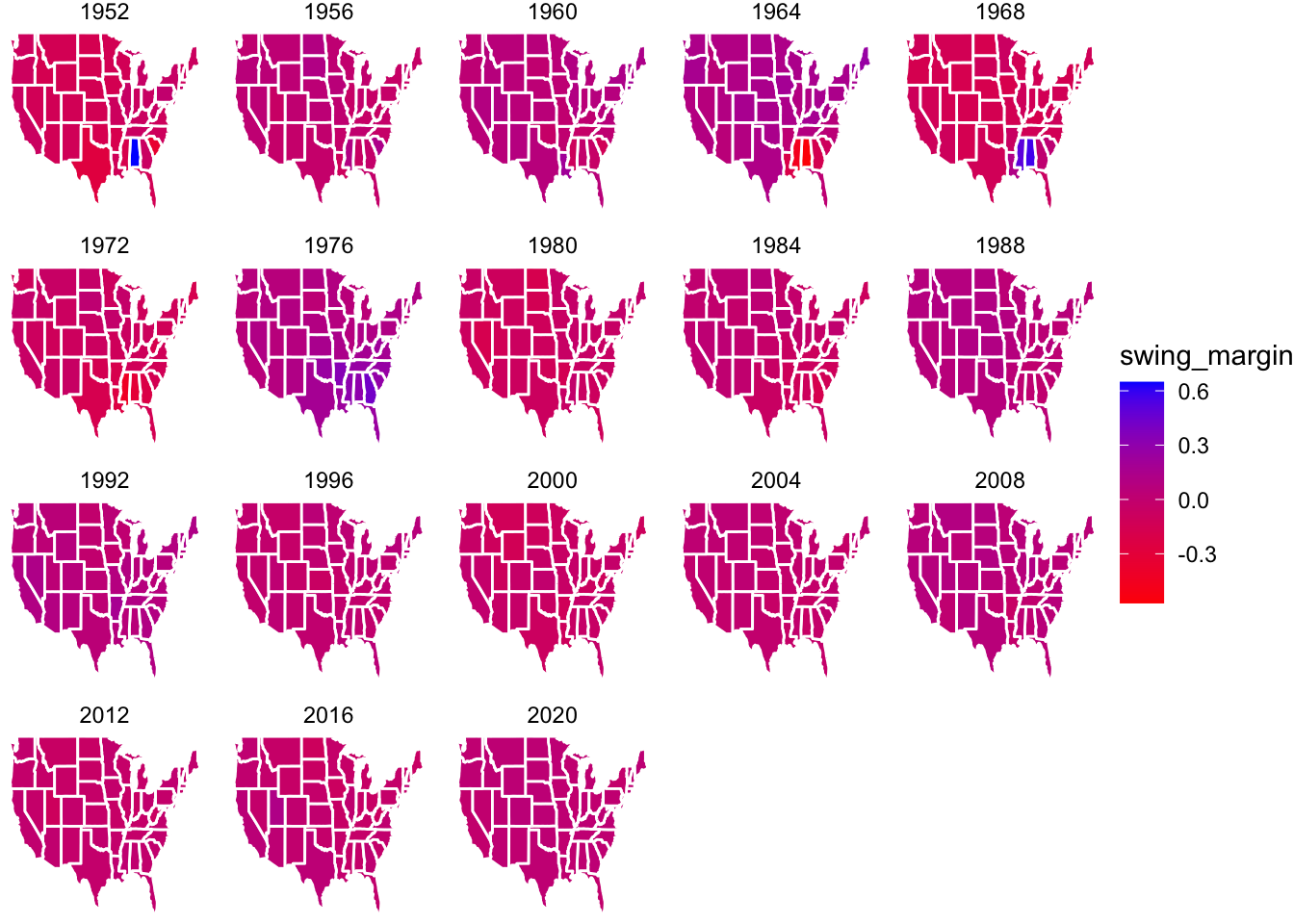
In this chart, states are colored based on how different their Democratic margin was from the previous election. So states with extremely strong red or blue fillings are considered battleground states, and states in the middle (purple/pink) are considered predictable from the last election. Some notable battleground states to come out of this plot are: Alabama and Mississippi in the 1964-1976 elections. This is notable because Alabama and Mississippi are now widely regarded as strong “red states.” However, the 1980 election was when Ronald Reagan was elected president, and coincides with the rise of the “New Right,” which likely cemented Alabama and Mississippi’s positions. Some additional battleground states weere Texas in 1952, 1968, and 1972; and Georgia in 1976. There are also some interesting geographic trends exposed here. For example, in 2000, the Northern Midwest/Plains region (Montana, Wyoming, North and South Dakota, and Iowa) consisted of all battleground states which have become more predictable over time. Only elections since 1952 are displayed because the data goes back until 1948, so for the 1948 election, we did not have a previous 2-party vote share to use in measuring how close the state’s race was.