Week 3: September 23, 2024
This blog is an ongoing project for Professor Ryan Enos' Election Analytics Course at Harvard College (GOV 1347, Fall 2024). It will be updated weekly with posts analyzing how different features impact the likelihood of Kamala Harris (D) or Donald Trump (R) winning the 2024 U.S. Presidential Election or winning specific states in the election. The blog will culminate in a final predictive model for the outcome of the general election.Context & Question
Since the 19th century, polls have been conducted to predict the outcomes of U.S. presidential elections. While they ultimately predict a binary outcome (i.e. will candidate A win or lose the election), they usually convey their results in percentages (i.e. what percent of the vote can candidate A expect to receive, what percent chance does candidate A have of victory). Polls do this at both the national level and the state level. The results are publicly disseminated, usually in newspapers. in addition to informing the electorate, they may influence voter behavior or motivation. This post asks whether polls (national or state) that show two candidates close to each other correspond to higher turnout rates and vice versa: whether polls that show one candidate defeating the other by a high margin actually discourage turnout (with voters reasoning that their opinion will not shift the result). If polls do cause turnout rates to change, they may also cause the results they're predicting to flesh out differently (if not every individual polled shows up to vote, then the results they contributed to forecasting will likely vary in reality). In this week's blog post, I analyze a set of presidential polling averages by state from 1968 through 2024 to (1) evaluate whether close polls are associated with higher or lower voter turnout and (2) evaluate whether polls that forecast close races should adjust for turnout in one direction, and polls that forecast landslide results the other. Recognizing that "should" is subjective, I use it to evaluate whether the poll would be more accurate compared to the actual result if adjusted for turnout (high or low).The Data
In this post, I convey polling averages in three datasets. The first contains candidates' polling averages from 1968-2016, the second contains the data from 2020, and the third contains the data from 2024. Each dataset is structured the same. They each contain a mix of nation-wide and state-wide polls and provide a percentage estimate for how much of the vote, in the nation or in the specified state, a candidate will receive. the particular candidate is named in a separate column. There is also a column in which the vote-share estimate is adjusted for national trends, but I choose to focus on the regular, raw percent estimates in this analysis.# load data--polling averages
avg_68_16 <- read.csv("pres_pollaverages_1968-2016.csv")
avg_20 <- read.csv("pres_pollaverages_2020.csv")
avg_24 <- read.csv("pres_pollaverages_2024.csv")
I obtained a dataset measuring voter turnout from The U.S. Elections Project. It provides data about the voting-eligible population in each state and what proportion of them actually cast a ballot. The limitation is that the dataset only spans the years 1980-2012. But since the polls in 2016 and 2020 were notably inaccurate, this could be a plus. I will build a model based on the results from 1980-2012, then test whether it would have improved prediction in 2016 and 2020. If it did, I will apply the model to 2024 prediction and if not, I will use non-adjusted 2024 polling data to predict the election outcome.
# load and clean turnout data
turnout <- read.csv("ep_turnout_80_14.csv", header=T)
colnames(turnout) <- c("Year", "State_Code", "Alpha_Num_State_Code", "State", "Pct_Ballots_Counted", "VEP_H_Office", "VAP_H_Office", "Total_Ballots_Counted", "Highest_Office", "VEP", "VAP", "Pct_Noncitizen", "Prison_Count", "Probation_Count", "Parole_Count", "Ineligible_Felon", "Overseas_Eligible")
turnout <- turnout[-1, ]
turnout$Year <- as.numeric(turnout$Year)
presidential_turnout <- subset(turnout, Year %% 4 == 0)
Methods
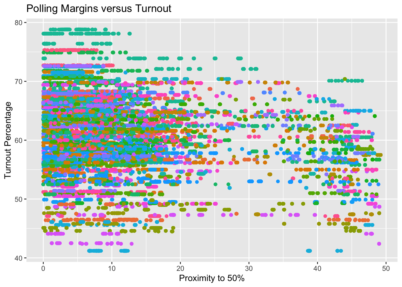
First, I look to compare polling averages to turnout within each state (in cleaning my data, I removed national polls from the dataset). The plot below shows the relationship between a poll's margin between candidates (i.e. how close/far a candidate is from polling at exactly 50%) and the percentage of eligible individuals who turned out to vote. The points are colored by state in case we can observe a starker relationship in some states than others (e.g. we may expect the difference to be more pronounced in typical battleground states).# explore: what is the trend between pct_estimate and Pct_Ballots_Counted?
ggplot(data=merged_data, aes(x=abs(50 - pct_estimate), y= Pct_Ballots_Counted, color=(state))) +
geom_point(show.legend=FALSE) +
xlab("Proximity to 50%") +
ylab("Turnout Percentage") +
ggtitle("Polling Margins versus Turnout")
Simple model interpretation: statistically significant
Since the dataset of polling averages contains multiple polls from each election cycle, conducted at various points throughout the cycle, there are multiple values of ‘Proximity to 50%’ that correspond to one, observed value of voter turnout. This introduces noise, and the number of polls conducted in a given state or election cycle becomes a factor in predicting turnout from the polling average, which is not intentional. To reduce the noise that this introduces, we can use a summary statistic about a candidate’s polling trend in each state in each cycle. Here I choose to use the average. In the plot below, I take the average of all polls of a particular state, candidate, and year, and use it as a predictor of turnout. The points are still colored by state. It is worth noting that this plot includes polling averages for both candidates in each election, which is a source of collinearity (in the same election, a higher estimate of vote share for candidate A will necessarily correspond to a lower estimate of vote share for candidate B and vie versa).
# clean a dataset that reflects the candidate's polling average over the whole cycle
yearly_polling_avgs <- merged_data %>%
                       group_by(state, cycle, candidate_name) %>%
                       mutate(polling_avg = mean(pct_estimate)) %>%
                       select(state, cycle, candidate_name, polling_avg, Pct_Ballots_Counted) %>%
                       distinct()
colnames(yearly_polling_avgs) <- c("state", "year", "candidate_name", "polling_avg", "turnout")

ggplot(data=yearly_polling_avgs, aes(x=abs(50 - polling_avg), y= turnout, color=(state))) +
  geom_point(show.legend=FALSE) +
  xlab("Proximity to 50%") +
  ylab("Turnout Percentage") +
  ggtitle("Average Polling Margins versus Turnout")
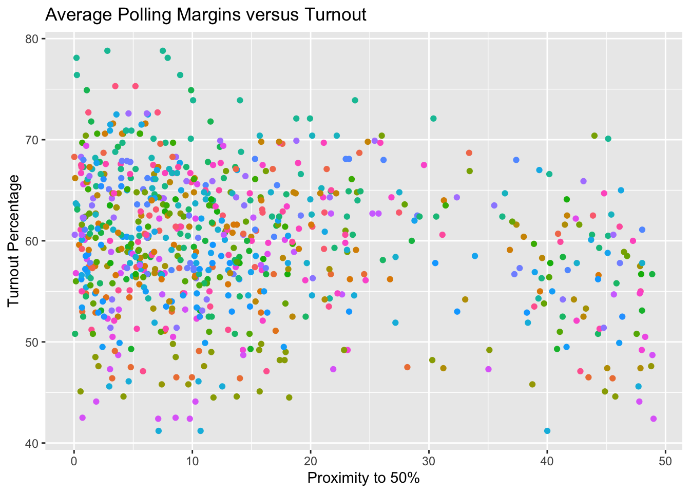
With 50 states represented, it is difficult to visually discern a relationship between how close a poll is and the turnout observed in its domain. I fit a multiple regression model below to determine if the effects of polling averages are more pronounced in some states than others. For each state, I obtain a coefficient for the extent to which polling averages explain variance in turnout in the elections between 1980 and 2012, and I order them from having the least effect to the most.
From the multiple regression model above, we can observe that North Carolina, Georgia, and Colorado show the strongest relationships between polling margins and voter turnout. These relationships are slight but positive, meaning that the further away from 50% a candidate is polling, the (i.e. the less-close an election), the more people turn out to vote, which is somewhat counter-intuitive. Again, the relationship is subtle with a correlation coefficient well below 1. Below, I graph the polling margins versus turnout rates for these three states only, to see this relationship.
ggplot(data=subset(yearly_polling_avgs, state %in% c("Georgia", "North Carolina", "Colorado")), aes(x=abs(50 - polling_avg), y=turnout, color=state, label=year))+
  geom_point() +
  geom_text(position=position_jitter(1, 1))
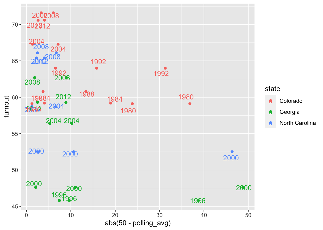
The other limiting factor of this relationship is that there is a lot of context about a state that drives turnout. For example, turnout may depend on the party of the candidate polling above/below 50%. Since we don’t know which candidate states care most about in an election, we include them all on this chart. But this dilutes the strength of the correlation by providing multiple x-values for one y-value (the different candidates’ polling averages correspond to the same turnout rate within a state). Or maybe voter behavior is driven by community norms and context, and completely independent of polling averages. We can look at a plot of some weaker relationships, in Hawaii and North Dakota, to observe this latter phenomenon.
ggplot(data=subset(yearly_polling_avgs, state %in% c("Hawaii", "North Dakota")), aes(x=abs(50 - polling_avg), y=turnout, color=state, label=year))+
  geom_point() +
  geom_text(position=position_jitter(1, 1))
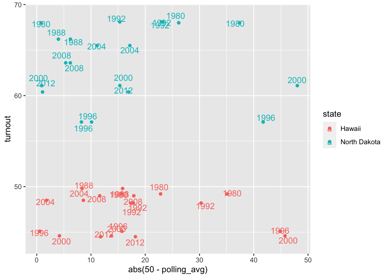
Something that this plot illuminates is the impact of state-specific trends/baseline levels of voter participation. In all of the elections represented, Hawaii has a relatively static turnout rate, despite variations in candidate polling margins. Its voter turnout trends may be explained by something unique to the state, that stays constant in the face of different candidates with different polling averages. The cause of different turnout rates in different states would make an interesting study in a future post.
Results & Prediction
The original question posed in this post was whether the predicted closeness of an election in a state impacted the result of that state by impacting voter turnout. Visually, the trends between polling margin and turnout were not particularly strong, but we can check their statistical significance. Below are the results of a model explaining turnout based on average polling margin, for all states combined (i.e. at the national level).
# investigate the coefficients
simple_model <- lm(Pct_Ballots_Counted ~ abs(50 - pct_estimate), data=merged_data)
summary(simple_model)
##
## Call:
## lm(formula = Pct_Ballots_Counted ~ abs(50 - pct_estimate), data = merged_data)
##
## Residuals:
##      Min       1Q   Median       3Q      Max
## -19.6689  -4.2809   0.1611   4.8572  18.2056
##
## Coefficients:
##                         Estimate Std. Error t value Pr(>|t|)
## (Intercept)            61.614914   0.026781 2300.66   <2e-16 ***
## abs(50 - pct_estimate) -0.111782   0.001594  -70.11   <2e-16 ***
## ---
## Signif. codes:  0 '***' 0.001 '**' 0.01 '*' 0.05 '.' 0.1 ' ' 1
##
## Residual standard error: 6.842 on 138959 degrees of freedom
## Multiple R-squared:  0.03417,	Adjusted R-squared:  0.03416
## F-statistic:  4916 on 1 and 138959 DF,  p-value: < 2.2e-16
This analysis shows that, at the national level, polling margin has a very slight impact on voter turnout. It is statistically significant, but the coefficient value of -0.111 conveys a very modest effect. I turn to investigating the state-by-state impacts of polling margin on turnout and print the coefficients and their p-values below:
The impacts of polling margin on turnout are significant in the following states:
- Colorado
- Florida
- Georgia
- Iowa
- North Carolina
- Virginia
To investigate whether polling margins should be adjusted to account for the effect of polls on turnout in these states in order to achieve more accurate election predictions, I will load and clean a dataset of state-level presidential returns from 1976 through 2020 from the MIT Election Data Lab. In this dataset, I removed rows about third-party candidates or write-in candidates to be more consistent with the polling averages datasets.
election_returns <- read.csv("1976-2020-president.csv")
election_returns <- election_returns %>%
                    filter(party_simplified %in% c("DEMOCRAT", "REPUBLICAN"), year >= 1980, year <= 2012) %>%
                    mutate(pct_received = candidatevotes/totalvotes)
Now, I would like to see how far off the polling averages were from the actual election returns for each of the 6 states that showed a significant relationship between polling margin and voter turnout, between 1980 and 2012.
# plot the amount by which polls were off from reality in the 6 states
filter_data <- joint_data %>%
               filter(state %in% c("COLORADO", "FLORIDA", "GEORGIA", "IOWA", "NORTH CAROLINA", "VIRGINIA"))

filter_data$index <- seq(1, nrow(filter_data))

ggplot(data=filter_data, aes(x=index, y=(pct_received-(polling_avg/100)), label=index)) +
  geom_point() +
  geom_text(position=position_jitter(0.01, 0.1)) +
  ylab("Difference in Polling and Vote Share") +
  xlab("Index") +
  ggtitle("Elections with the Greatest Polling and Outcome Differences")
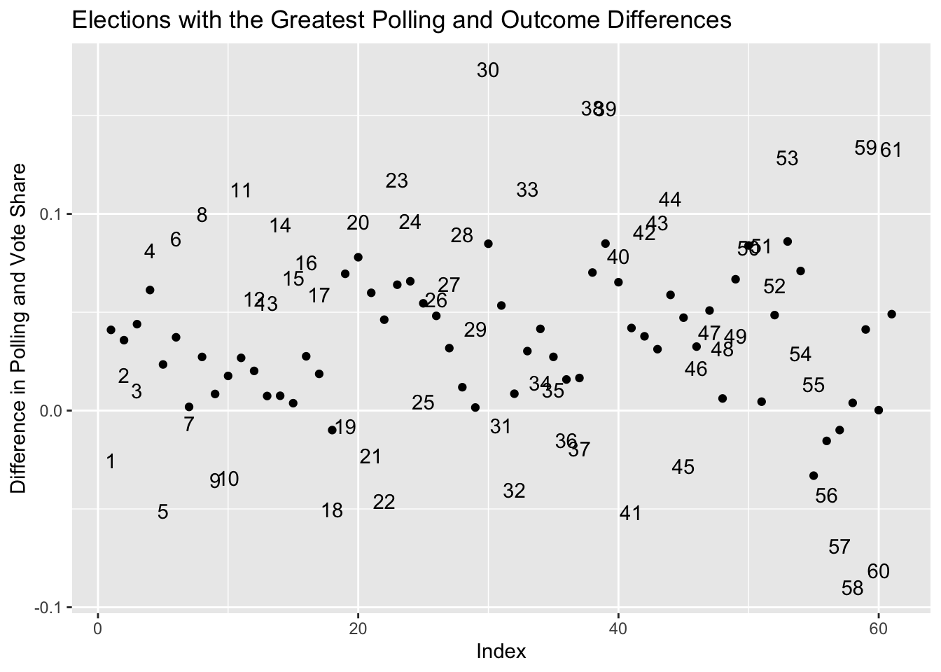
The outliers on the plot above represent elections in which the polling estimates were significantly different than the real outcomes. Elections were numbered with an index in the dataset, which is where the numbers on the plot come from. Since the dataset has data about how both candidates in each election performed in the polls, we notice that there are multiple points for the same election here, and it makes sense that their errors would be plotted on opposite sides of ‘0’ because an over-estimate for one candidate guarantees an under-estimate for another. The races with the biggest discrepancies were:
Each of the races in the dataframe above showed a 5-point or more difference between the candidate’s polling average and their actual vote share in the specified state.
Based on these outcomes, I create a set of weights by which to multiply the polling averages, to minimize the differences between their predictions and the true outcomes. Then I test whether the weights can be applied to improve predictions for the elections in these states in 2016 and 2020. If they do improve predictions, I will incorporate them into a prediction of the 2024 election based on polling, and if not I will exclude them.
# creating the weights -- minimize `diff` in a given state
widest_differences <- widest_differences %>% arrange(state, year) %>% mutate(polling_pct = polling_avg / 100)

states <- 6
weights <- rep(NA, 6)
for (i in seq(1, states)) {
  races <- subset(widest_differences, state == unique(widest_differences$state)[i])
  weights[i] <- sum(races$pct_received) / sum(races$polling_pct)
}

weights_df <- data.frame(state = unique(widest_differences$state), weight = weights)
Below are the races for which weighting improved the predictions of polling (i.e. made them closer to the actual outcome):
subset(effect_of_weights_2016, abs(differences_with_weights) < abs(differences)) %>% arrange(state)
##            state differences   weight differences_with_weights
## 1       COLORADO  0.06190332 1.148897            -0.0005839391
## 2        FLORIDA  0.06424174 1.163012            -0.0051976346
## 3        GEORGIA  0.05306180 1.152272            -0.0161687381
## 4        GEORGIA  0.03624860 1.152272            -0.0277285215
## 5           IOWA  0.09517054 1.166919             0.0256571968
## 6 NORTH CAROLINA  0.06963555 1.164060            -0.0006880618
## 7       VIRGINIA  0.06849504 1.172130             0.0038116035
## 8       VIRGINIA  0.04336288 1.172130            -0.0348102710
In 2016, all 6 states’ predictions were improved with the weighting scheme applied. I repeated the same process and then found the races for which the same weighting scheme improved the predictions for 2020:
# improved for 2020
subset(effect_of_weights_2020, abs(differences_with_weights) < abs(differences)) %>% arrange(state)
##            state differences   weight differences_with_weights
## 1        FLORIDA  0.06042327 1.163012              -0.01322137
## 2           IOWA  0.04965512 1.166919              -0.03018996
## 3 NORTH CAROLINA  0.03985458 1.164060              -0.03552920
In 2020, 3 states’ predictions were improved by applying this weighting scheme. Given the positive effects of the weighting scheme on the polls’ predictions in 2016 and 2020, I will apply it to data from 2024 to make a forecast. I still want to include polling averages from the other states, but I will not weight them in this prediction. I will only weight the 6 from above.
avg_24 <- subset(avg_24, !is.na(pct_estimate)) %>%
          mutate(state = toupper(state)) %>%
          left_join(weights_df, by=join_by(state))

avg_24$pct_multiplier = case_when(!is.na(avg_24$weight) ~ avg_24$pct_estimate * avg_24$weight, is.na(avg_24$weight) ~ avg_24$pct_estimate)

avg_24 <- avg_24 %>% group_by(state, candidate) %>% mutate(polling_avg = mean(pct_multiplier)) %>% filter(candidate %in% c("Harris", "Trump"))

# for each of the candidates, find their whole polling average across states
# this is not an electoral prediction but a vote share prediction
Harris_pct <- mean(subset(avg_24, candidate == "Harris")$polling_avg)
Trump_pct <- mean(subset(avg_24, candidate == "Trump")$polling_avg)
Based on the model built in this blog post, which involved computing a set of weights to adjust polling predictions in certain states, based on historical discrepancies between polls and real election outcomes, we found the share of the popular vote that Kamala Harris and Donald Trump will win in each state. It is worth noting that Robert F. Kennedy (RFK) was excluded from the analysis but included in the dat that pre-date his campaign suspension, so the percentage of the popular vote for Donald Trump may be a few points higher, under the assumption that votes previously intended for RFK will be re-allocated towards Trump. On average, across states, we found that Kamala Harris will receive 58.69% of the popular vote and Donald Trump will receive 45.19%, which is reasonable given how close of an election this is.